 typography + DESIGN + COPY © MAX SINGER 2014
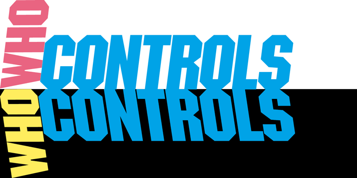
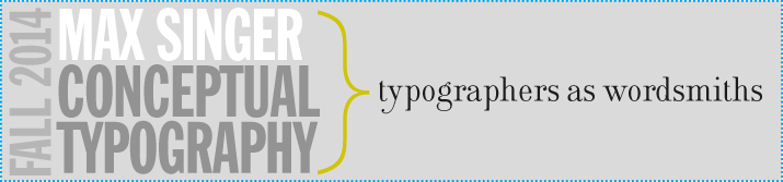
Typographers are Wordsmiths
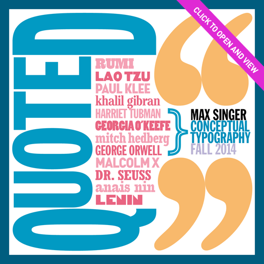
Design is generally thought of as a visual medium and perhaps in its “purest” form — the arrangement of shapes, colors and images — it is. Yet, as soon as words, or, at least, “written” words become part of the equation (as in the case of typographic design) which in the real world they most often are, the situation becomes less clear. The “written” word or more accurately the “seen” word, is certainly a visual element. But at the same time, obviously, a verbal element. Words are placeholders, 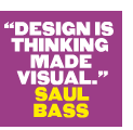 abstract symbols representing something else, a thing, an idea, a thought, an emotion. Words are strung together to make sense. The problem is that words are shape-shifters. Their sense is always ambiguous. Just ask a lawyer or advertising copywriters for whom the ambiguity of words is their stock in trade. If words, and their offspring — sentences, phrases (mission statements?) — were not ambiguous there would be no need for actors or directors (or typographic artists) because then there could only be one possible interpretation of Hamlet or King Lear or The Tempest. And yet there are many Hamlets, Lears and Prosperos. So what does all this have to do with the practice of typography? My contention is that typography in its “highest” form is a hybrid artform both visual and verbal, an interpretive artform, and the typographer is an interpretive artist, not unlike the actor, director, or concert musician. Certainly in its most elemental form, typography involves choosing a typeface* to clearly convey a message or information. This is not meant to undervalue the importance of clarity and legibility. Simple communication is central to much of what typographers do day-to-day. But for myself, my challenge, my “kick”, is to take my typographic skills to that higher, more conceptual, illustrative, interpretive level. I have tried to do so with the selections contained in the first issue of “Quoted.” Whether or not I have done so I leave up to you. —MAX
*i will not get into any unneccessary, esoteric or technical arguments about what the differences are between fonts, typefaces and/or font families. THE distinctions ARE REALlY NOT THAT RELEVANT ANYMORE AND, BESIDES, If you don't know what I'm talking about you SHOULDn't be reading this.
BACK TO TOP
to receive “quoted” click here & write signup in the subject line
MAX SINGER
176 EAST 81ST STREET NO. 2D
NEW YORK CITY NEW YORK 10028
1.212.288.2239
MAX@MAXSINGER.COM
max singer is:
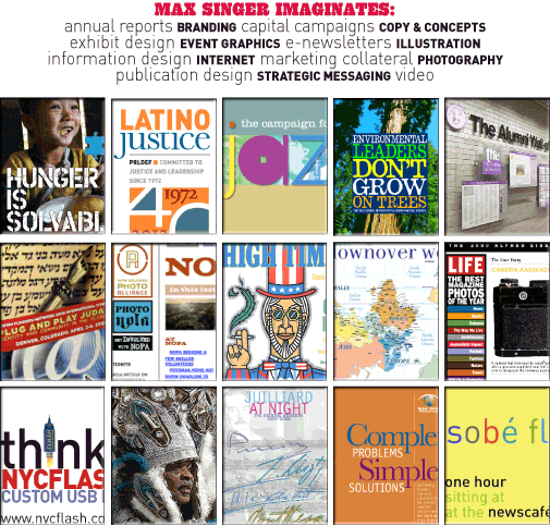
I am an award-winning digital and print graphic designer, writer and art director who has conceived and produced branding, marketing collateral, websites, publications, annual reports, advertising, direct mail, exhibits and more for clients ranging from Fortune 500s to not-for-profits to mom-and-pops.
![]()
I am also a nationally published editorial illustrator and cartoonist who was associated with the world-famous Push Pin Studio and recognized by the Society of Illustrators; a first-rate copywriter and humorist; an innovative, exhibiting photographer and painter; and an out-of-the-box thinker.
![]()
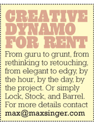
I have taught at the School of Visual Arts and Pratt Institute and work as a pro bono consultant with Taproot Foundation. I’ve worked with and for some of NYC’s top designers and companies and I’d love to work with you or for you. From guru to grunt, from rethinking to retouching, from elegant to edgy, by the hour, by the day, by the project. Or simply Lock, Stock, and Barrel.
copyright max singer
2006-2014.
![]()
contact:
max@maxsinger.com